COLOR ~ From the book More Is More Is More: Today’s Maximalist Interiors
© Carl Dellatore, September 27th, 2022. Rizzoli New York
Lush color is the key to maximalism, as is a willingness to split with established color theory. And don’t forget to add in an unbridled dose of creativity. Along with pattern and silhouette, color makes up the triad of the foundational elements in maximalist design. One might argue that color is the most important of the three.
Historically speaking, there are countless design luminaries who understood and employed a rich, maximalist approach to color in their work. Perhaps the best example is high-society designer Dorothy Draper and her landmark decoration of the Greenbrier hotel in White Sulphur Springs, West Virginia. Her brazen use of green, juxtaposed against red, reinvented a color combination that was once relegated to the end-of-year holiday season. And let’s not forget the boisterous mix of shades she conjured for each of the Greenbrier’s bedroom suites: yellow curtains against pink ceilings against red upholstery against teal-striped walls, plus riotous floral bedspreads for good measure!
And it’s impossible not to remember Billy Baldwin’s decoration of legendary fashion editor Diana Vreeland’s living room, affectionately dubbed the “garden in hell.” Published in Architectural Digest in the September/October 1975 issue, the crimson-clad salon, with its floral chintz–lined walls and matching curtains, most certainly set a few dinner-party conversations ablaze with its unabashed flair.
Other notable rooms with a maximalist approach to color include Albert Hadley’s legendary brass-lined oxblood library for Brooke Astor with its iconic La Portugaise chintz upholstery; Virginia-born tastemaker Nancy Lancaster’s drawing room on London’s Avery Row, with its walls sheathed in her famous “buttah-yellah” shade of yellow paint and festooned with corn-silk curtains; and Mark Hampton’s brownish black–walled library for Sue and Haydn Cutler, in Fort Worth, Texas, set off in sharp contrast by crisp white furniture and a neutral sisal rug. Even today, these rooms look bold and eye-catching. It’s obvious why they’ve earned a place in the annals of color-referenced design history.

Today, as a culture we’ve pivoted to the eye-popping, kaleidoscopic, color-rich spaces that define contemporary maximalism. This all invites the question, How do I incorporate maximalist color in my home?
Esteemed interior designer Robert Couturier once told me, “I think the basics about color are like grammar: You need to learn it; you need to absorb it. And then you need to forget it. Taking risks with choosing color is key.”
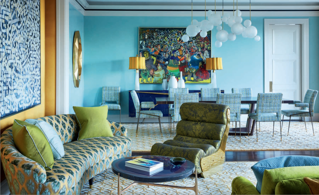
Taking risks, indeed. As you turn the pages to enjoy the many glorious rooms included in this chapter, you will see designers pushing the limits with color, such as a living room inventively striped in vertical bands of progressive hues, drawing your eye around the space, or a room lacquered in a rich marine blue set off by a mix of eggplant-purple and lime-green furniture. Taking risks with assertive color creates one-of-a-kind spaces that catch the eye and delight the visitor.
How do you know if you’ve landed on the best color, or color combination? I respectfully defer to the aforementioned Dorothy Draper, who famously said, “If it looks right, it is right!”