ELEMENTS ~ From the book More Is More Is More: Today’s Maximalist Interiors
© Carl Dellatore, September 27th, 2022. Rizzoli New York
There are times when a maximalist interior is defined by a singular element, challenging the typical maximalist convention of a densely populated room that combines a myriad of finishes and furnishings. In these unique spaces, paradoxically speaking, less can be maximalist too. On the other hand, there are rooms where a single design element is used multiple times—either densely populated in one area or scattered throughout—adding visual interest and maximalist flair. However a potent element is utilized, it can carry a space, becoming a focal point that punctuates a room in a superlative way.
As a rule of thumb, using an element or elements in a maximalist manner can be successfully achieved in three primary ways: through the manipulation of scale; through the singularity of an element; and, in the case of collections, through repetition.
On the subject of scale, I’m reminded of what legendary designer Juan Montoya wrote on the subject in my book Interior Design Master Class: “Create a focal point from the best pieces you can muster. Dare to be imposing. Even a small room may take on majesty if one orchestrates, sparingly, significant pieces within it: large in size, superb in style, and high in quality.”

Several rooms in this chapter exemplify the ideas Montoya puts forth. One in particular is the wood-paneled entryway of a stately Tudor-style home, spare and rather austere, with an immense sculptural foot by the Italian artist Gaetano Pesce centered on an unadorned floor. Another features a piece of functional sculpture in the form of a monumental door—commissioned by the designers—set off by uniquely faceted walls. In both cases, exaggerated scale telegraphs an arresting more-is-more feeling. But when going for grand gestures, there is one caveat: dynamic pieces benefit from negative space around them, so that they can be fully appreciated.
With regard to singularity, an element in a room might stand out for its rarity or the way it’s been positioned in relation to other elements, allowing it to take center stage. An illustration you’ll find in this chapter is an antique mirrored tester bed positioned on a grand-scaled stenciled floor and surrounded by serene pink walls.
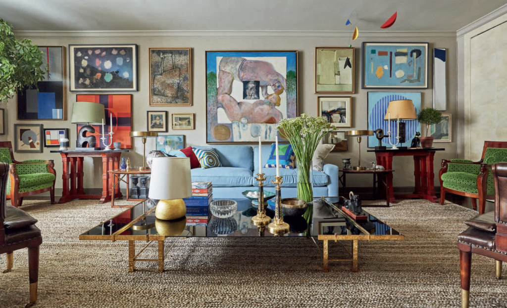
Perhaps the idea most easily employed in maximalist interior design is the repetition of an element. Designers return again and again to this idea as a way to turn up the volume in a room. One fine example in this chapter is the ceiling of an elegant Dallas living room, which is covered in crisp, white-painted decorative plaster blocks. And there are several glorious rooms with a collection of artworks hung gallery-style that collectively command attention.
Whatever the approach, one thing is paramount: choosing the elements of a maximalist space should be an enjoyable process. Pick elements that you respond to emotionally, elements that you will be happy to live with. Joy is a precious commodity, so by all means have it in abundance at home.