SURFACES ~ From the book More Is More Is More: Today’s Maximalist Interiors
© Carl Dellatore, September 27th, 2022. Rizzoli New York
No book about maximalist interior design would be complete without mention of Tony Duquette, one of the genre’s most celebrated practitioners, who combined fantasy, theatricality, and audacity in equal measure. His aesthetic steeped in global references, Duquette conjured rooms that appear otherworldly, with every surface embellished in wonderfully imaginative ways: Styrofoam fruit crates attached to a ceiling and painted, trompe l’oeil malachite in rich verdant green sheathing the walls, and black-and-white checkerboard floors overlaid haphazardly with gloriously patterned rugs.
Like Duquette, contemporary interior designers know that the majority of rooms are created with a cube or rectangle as their framework. And these rooms have six surfaces: four walls, the floor, and the ceiling. Combined, those six planes create an envelope within which designers can realize endless maximalist ideas.
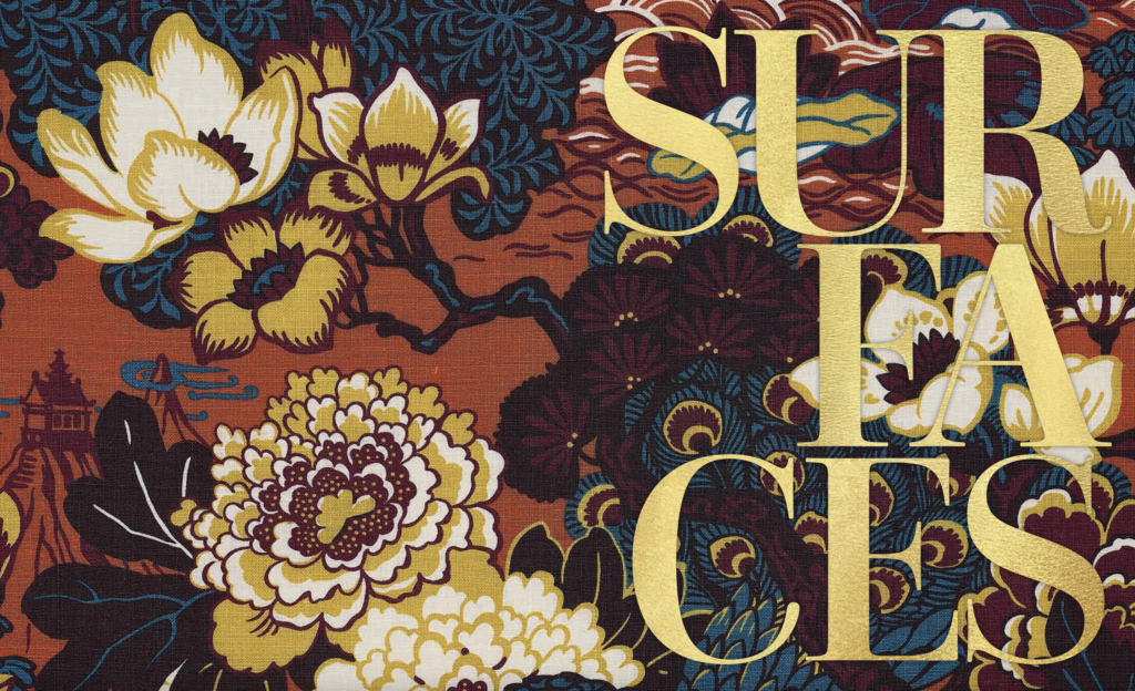
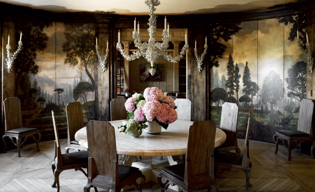
Because of the number of square feet involved, the four walls of a room provide designers with the biggest way to pack a maximalist punch—both by utilizing standard finishes like wallpaper and paint and by envisioning one-of-a-kind surfaces created by artisans. A good example is walls conceived with bold, graphic patterns or a mix of patterns, or walls that juxtapose a matte finish against lacquer, allowing the light to change as it moves from surface to surface. An adventurous designer might create walls that stand in stark contrast to a room’s furnishings—perhaps a stylized floral wallpaper set off by a clean-lined Parsons table. These are just a few ways to decorate vertical planes to enhance a maximalist space. You’ll find many more striking and unusual wall treatments in the pages of this chapter.

The floor is the fifth surface in a room, and it has one intrinsic requirement: it must be durable. No matter the material or finish, the floor must withstand the punishment of daily traffic, children, and pets. The good news? Maximalist patterned floors, like a geometric carpet or an intricately tiled mosaic, hide a multitude of sins. In the case of the latter, stone often looks better as it ages; the same could be said for wood floors. Patinated surfaces imbue a room with a sense of history and grace.
Turning to the sixth surface in every room, the ceiling, the legendary twentieth-century decorator Albert Hadley once said, “Ceilings must always be considered. They are the most neglected surface in a room.” Contemporary maximalist designers would surely agree with Hadley. High-gloss lacquered or mirrored ceilings reflect light and add drama; wallpapered ceilings draw the eye up and can be everything from restful to kinetic. For the adventurous designer, the sky’s the limit—pun intended—when it comes to decorating the ceiling.
Finally, a note of caution: not every surface should be over the top. On the contrary, maximalist rooms benefit when they strike a balance, with some surfaces receding and others taking center stage. A juxtaposition of pattern, color, and texture, in the words of Diana Vreeland, allows the eye to travel.