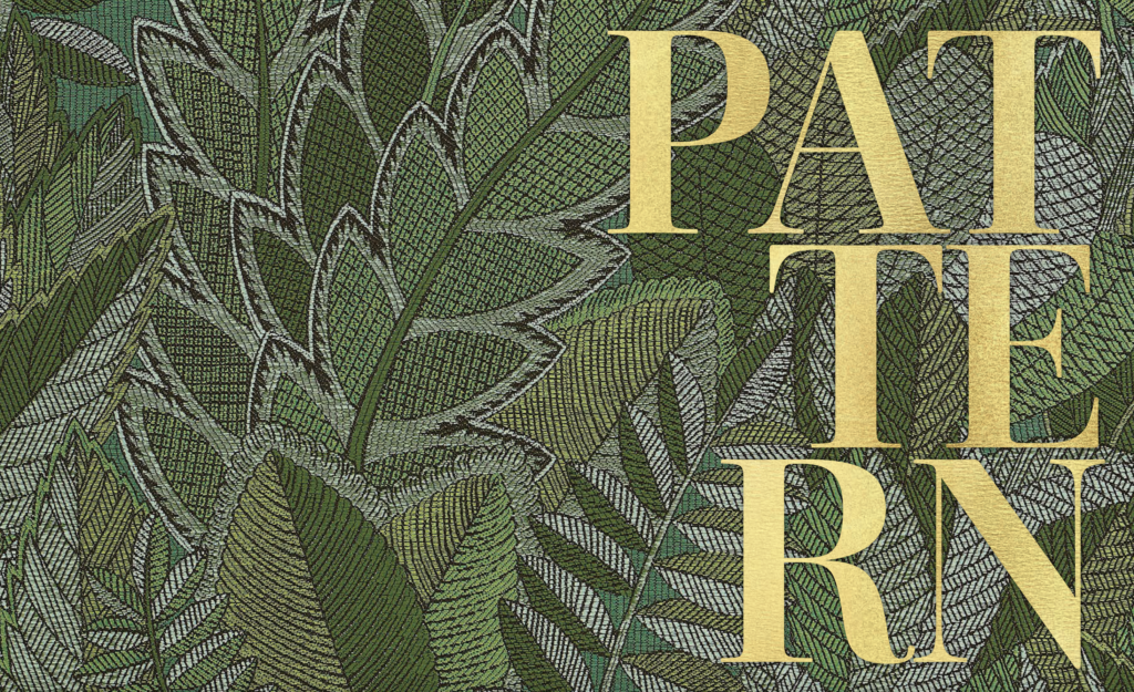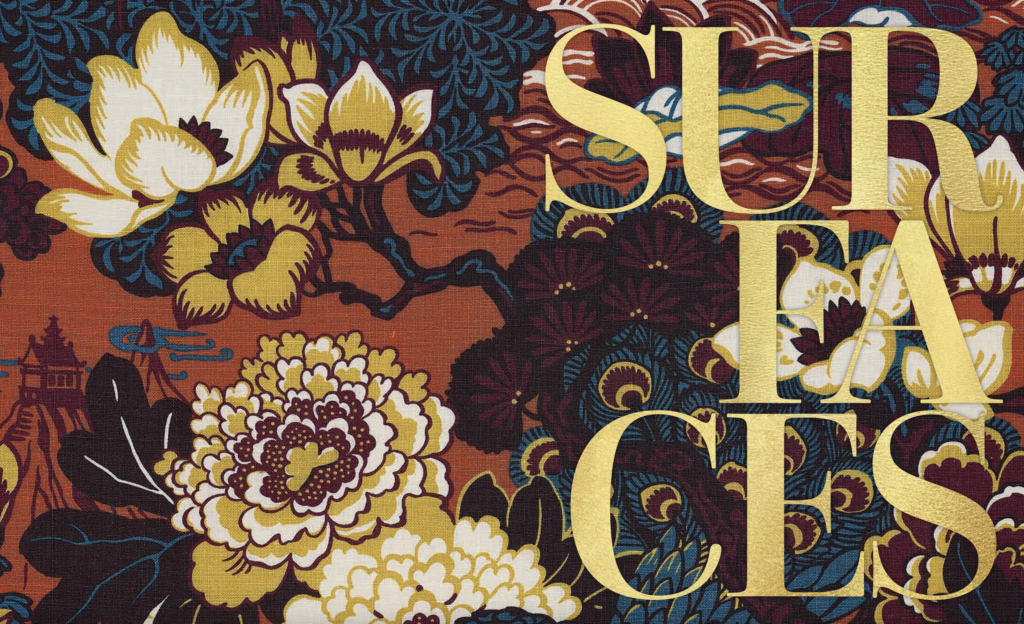
PATTERN ~ From the book More Is More Is More: Today’s Maximalist Interiors
© Carl Dellatore, September 27th, 2022. Rizzoli New York
In my former career as a textile designer, pattern was an omnipresent concern. Creating a design element and then engineering it to echo across the width and length of fabric was challenging yet very enjoyable work. And while stripes have always been a personal fascination, there’s a vast, ever-expanding trove of patterns for designers to utilize in maximalist rooms.
The patterns in use today have their origins in many cultures, with motifs originating from East to West. There are time-honored Persian paisleys, both traditional and contemporary interpretations; adaptations of ancient Roman herringbones in every color of the rainbow; ginghams, which are thought to be of Malaysian origin, from the Malay word genggang; tree-of-life designs born from Indian bedcovers and tent panels called palampores; and bountiful florals traced back to China and subsequently reinvented by Europeans.
As dizzying as the breadth of patterns that exist is, there is an equally vast number of ways in which interior designers can deploy them. A grand-scaled William Morris design from the mid-nineteenth-century founder of the Arts and Crafts movement might be papered around the perimeter of a library, creating a kinetic rhythm. An awning stripe fashioned into tasteful curtains hung from lacquered white rods can serve to impose order on the landscape just outside the window. And speaking of outside, an English floral chintz, covering a range of upholstery silhouettes, transports the visitor to the gardens of a historic Essex manor house in the languishing days of a British summer.

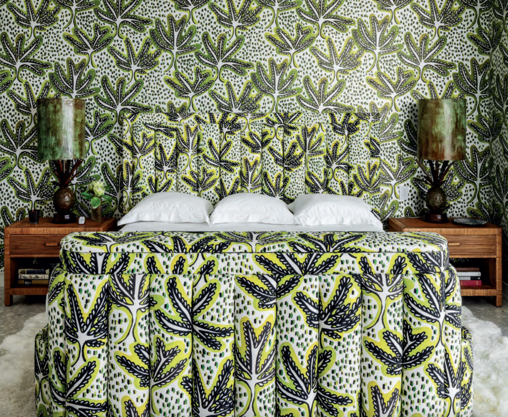
Then there’s the artful juxtaposition of patterns, giving maximalist designers an opportunity to mix and match to create a range of effects. A decadent salon sheathed in an electrifying mix can feel like a 1990s Christian Lacroix haute couture runway show, providing the backdrop for invigorating conversation. Alternately, a demure bedroom with patterns that reveal a graceful mix of motifs encourages a sense of serenity just before slumber. There’s always something that creates a connection—either overtly or in a nuanced way.
Repetition of color is one tried-and-true option for mixing patterns in successful maximalist rooms. For example, a chevron-patterned rug woven in brown and white would pair perfectly with a Moorish-motif wallpaper similarly inflected with brown and accented by powder blue and silver. Repeating motifs works just as well: a delicate Indian lotus print on a tablecloth trimmed with a deep bullion fringe would mix perfectly with a blossoming peony fabric on a collection of throw pillows. The mix could be further unified by a rose-covered Aubusson underfoot, resulting in a verdant botanical flair.
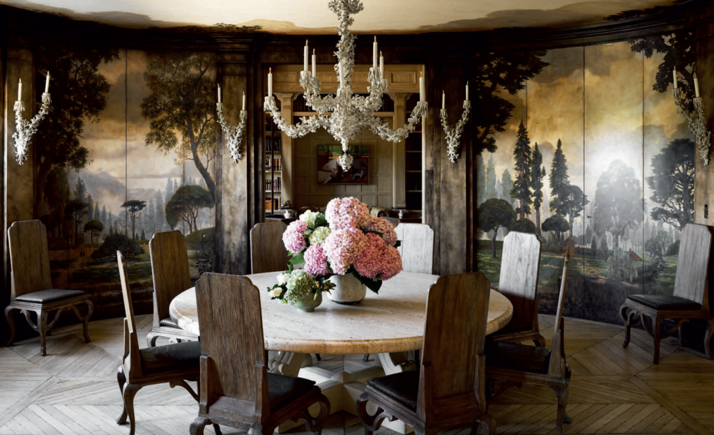
Utilizing geographical references is also an excellent way to link patterns. Think wallpaper populated with chinoiserie pagodas set against a bamboo trellis upholstered on a pair of club chairs, then paired with a stylized chrysanthemum-covered folding screen. To take this idea a step further, a designer might choose a variety of locales by combining a Francophile toile, a Portuguese azulejo, and a Florentine vine, tracing a path around Europe.
With the vast knowledge the designers in this book possess on the history of the decorative arts—coupled with their curiosity and intuition—it’s no surprise that the rooms in this chapter brim with the creative use of pattern. As they would likely all agree, using patterns successfully comes down to what appeals to us personally. To quote the legendary decorator Billy Baldwin, “Be faithful to your own taste, because nothing you really like is ever out of style.”

